

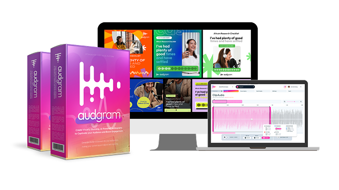
 Commission disclosure: This article includes a promotional link to AudGram. The guidance below is educational, not a hands-on review or a claim of results.
A readable audiogram is one that communicates quickly on a small screen: viewers can identify the topic, follow the captions, and recognize the brand without the layout feeling crowded. AudGram’s live offer, checked on 2026-09-14, describes a template-based workflow for turning audio or video into audiogram exports. This guide focuses on design choices that make that output easier to read and reuse. For broader offer context, see the commercial overview.
What makes an audiogram readable in a feed
Readability starts before colors or effects. In a scrolling feed, the viewer needs three things fast: a clear topic signal, a caption area that is easy to scan, and a visual frame that supports the message instead of fighting it. If those pieces are all loud at once, the design becomes harder to process.

Think of the layout in layers. The first layer is the message cue, such as a short hook or episode title. The second layer is the transcript, which needs to stay legible at phone size. The third layer is the brand frame, including logo placement, colors, and template structure. When each layer has a job and only one layer is dominant, the viewer can understand the clip with less effort.
Set visual hierarchy before you decorate
Hierarchy tells the eye where to go first, second, and third. For branded audiograms, captions should usually outrank decorative elements, because they carry the spoken message. A logo should help recognition, not compete with the transcript. If a brand mark is large enough to pull attention away from the words, the design is doing too much branding and not enough communication.
A practical structure is one dominant text zone and one quieter brand zone. For example, a short hook can sit near the top while the caption block occupies the lower third with adequate padding. That arrangement gives the viewer a clear reading path and leaves room for brand consistency across episodes or campaigns.
If you are still choosing the excerpt itself, it helps to start with a self-contained segment so the design supports a complete thought; see the excerpt-selection guide.
Typography and caption contrast for small screens
Typography is a readability decision first and a style choice second. Thin weights, overly condensed letterforms, and low-contrast text can disappear quickly on phones. A safer approach is to use a simple font with open shapes, keep line lengths short, and avoid squeezing too many words into one line.
Caption contrast should be checked against the background and any animated elements behind the text. Light text over a bright or busy image may look polished in a mockup but become hard to read in practice. The same problem appears with dark text sitting on top of a textured background or waveform. If needed, use a solid or semi-solid caption backing and leave enough padding so the words stay visually separate from motion.
A useful check is to view the design at mobile size rather than relying on a desktop preview. If the caption can be read quickly at that scale, the hierarchy is probably working. If not, simplify the background before you enlarge the text or add more styling.
Use waveform and progress elements with restraint
Waveforms and progress bars can help viewers orient themselves, but they should remain supporting elements. Their job is to add motion and pacing, not become the headline. A restrained waveform is usually thinner, quieter, and placed where it reinforces the audio without cutting through the most important text.
When waveform graphics are too large or too bright, they create visual noise around the transcript. That is especially risky in short-form feeds, where the viewer has only a moment to absorb the clip. A better rule is to reserve the strongest contrast for the words and keep motion effects secondary. If the clip is meant to teach, persuade, or tease an episode, the waveform should stay in the background.
One simple test: if removing the waveform makes the audiogram easier to read, the waveform was probably too prominent. If removing it makes the clip harder to orient, the balance may have been closer to right.
Build a branded layout you can repeat
Repeatable templates save time and reduce inconsistency. Start by locking in the few design choices that should stay stable: headline position, caption style, logo placement, and one or two brand colors. Then decide what can flex from clip to clip, such as background imagery, motion intensity, or the amount of empty space. This gives you a recognizable system instead of a different layout every time.
A practical template checklist:
- The hook is short, specific, and easy to scan.
- Captions have strong contrast and enough padding.
- Brand elements support the message rather than replacing it.
- Waveform and progress graphics stay secondary.
- The layout still works at small-screen size.
- There is safe space to adapt the design across square, landscape, and portrait outputs.
If you also need to reframe the same design across 1:1, 16:9, and 9:16 outputs, the composition stage matters as much as the styling stage; see the format adaptation guide. If you later want to tighten timing, wording accuracy, and line breaks, the caption QA guide is the next step.
A practical branding workflow
For a typical branded audiogram, start with the excerpt, then place the captions, then add the smallest effective brand signals. That order keeps the message readable before visual identity is layered on top. For example, if a podcast clip contains one strong takeaway, you might keep the episode title compact, place the logo in one corner, and use a muted waveform beneath the transcript. The result feels branded without becoming crowded.
When you are building multiple templates, work from the same structure each time so your team does not have to relearn the layout. Consistency also makes later editing easier, because any new clip can inherit the same hierarchy rather than being designed from scratch. That usually reduces revision back-and-forth and helps the series feel cohesive.
The entry offer checked on 2026-09-14 lists template editing, captions, waveform animation, logo placement, and export formats. If you are comparing the current checkout details, use the official page and confirm the final amount there before purchase: AudGram.
Design checklist for a readable branded audiogram
Before export, confirm the design answers these questions:
- Can the main idea be understood in one glance?
- Does the caption area remain clear on a phone screen?
- Are brand elements supporting the message rather than replacing it?
- Do waveform and progress effects stay secondary?
- Would the layout still work if the audio clip changed?
If the answer to any of these is no, simplify before exporting. Good branded audiogram design is less about adding more visual features and more about making the spoken message easier to follow.
For planning what happens after design, including export version control and project archiving, the export and archive guide covers the next workflow step.
Used carefully, a readable branded audiogram can make spoken content feel polished without burying the transcript or the clip’s main point. The safest rule is simple: design for clarity first, then brand the space that remains.
For the broader buying context and offer limits, return to the commercial overview.
Reader questions
How do I decide whether a branded audiogram is readable enough for mobile viewers?
Check it at phone size, not just on a desktop monitor. The hook should be short, the captions should have enough spacing to read quickly, and the logo should not interrupt the main text flow. If you need to zoom in to understand the clip, the hierarchy is too busy and should be simplified before export.
Should the logo be large on an audiogram so people notice the brand quickly?
Usually not. A logo should support recognition without taking attention away from the message. In a readable layout, the brand mark is present but quiet. If it competes with the captions or title, reduce its size or move it to a less demanding part of the frame.
What is the safest way to use waveforms in a branded template?
Keep waveforms supportive and restrained. They should add motion and pacing, not become the most visible object on the screen. Thin, low-distraction waveform styling is usually easier to read than a loud graphic that slices through the caption area.
How can I make captions easier to read on visually busy backgrounds?
Increase contrast first, then simplify the background. A simple font, enough padding, and a solid or semi-solid caption backing can help the words stand apart from texture or motion. If the background is still fighting the text, use less visual detail rather than relying only on bigger type.
Do I need to redesign every audiogram from scratch for each format?
No. A repeatable template can usually be adapted across square, landscape, and portrait layouts if you plan safe space early. Keep the core hierarchy stable, then recompose the elements so the captions, logo, and motion still fit cleanly in each aspect ratio.
