

Disclosure: ProdifyDigital may earn a commission if you purchase through the ClipMagic link in this article, at no extra cost to you.
Direct Answer & Introduction
Your captions look impressive on the editing monitor. On a phone, they cover the speaker's mouth and disappear before the sentence lands. The style is doing more work than the message.
Choose readable caption styles by testing clear lettering, stable contrast, sensible placement and comfortable timing on the smallest screen your audience uses. Start with a restrained preset, then change only what improves understanding. Brand colour is an accent, not a reason to make words difficult to read.
This guide helps creators using ClipMagic or another caption editor turn a visual preference into a practical decision. The goal is not to find a universally “best” font; it is to make your particular video easier to follow.
Fundamentals
Readability is a relationship, not a font setting
A caption sits on top of a changing picture. White lettering may be clear over a dark wall and disappear when the shot cuts to a bright window. Size, background, letter shapes, line length and viewing distance work together. Judge them in motion, not from a single attractive still.
ClipMagic's official caption guidance describes changing fonts, colours and individual caption positions. Those choices let you adapt a style to the footage. Our ClipMagic review separates those editing capabilities from the offer's plan limits.
The W3C's caption guidance also distinguishes caption presentation from the underlying information. Some players allow viewers to customise caption styling; text permanently rendered into a video does not offer the same flexibility. A fashionable animated treatment should not be treated as proof of accessibility.
Decide what the viewer must see
Before positioning text, identify the important areas: the speaker's face, a product demonstration, an on-screen label or the place a cursor clicks. Leave those areas clear. Check the destination platform's actual preview, because buttons and descriptions can occupy space that looked empty in your editor.
Main Process / Strategies
Start with a quiet, legible baseline
Choose a straightforward typeface with distinguishable letter shapes. Use a size you can read comfortably on a phone without leaning closer. Give the lettering a stable background treatment when the footage changes brightness. Resist adding several colours, outlines and effects at once: you will struggle to tell which change helped.
Proofread before judging style. If the text itself is wrong, better presentation makes the error more conspicuous. Use our audio-first caption proofreading process before the final visual pass.

A hypothetical crowded-versus-clear comparison
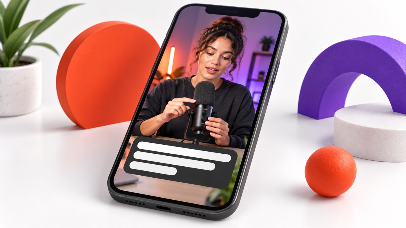
Imagine a thirty-second tutorial showing someone connecting a microphone. In the first version, orange letters sit directly over an orange shirt, each word grows and shrinks, and a long caption covers the connector the viewer needs to see. Nothing is technically missing, but the reader has to fight three competing signals.
For a second version, keep the same corrected words. Use white lettering on a dark backing, move the caption away from the hands and connector, and divide the sentence into meaningful phrases. Retain a small orange accent if it remains clear, but remove the continuous scaling animation. Now the visual treatment supports the demonstration instead of competing with it.
This is a design example, not a test proving higher retention. Compare both versions at normal speed on the same phone. Ask which one lets you read the instruction and identify the connector without replaying. If both fail, shorten or slow the underlying explanation rather than shrinking the text further.
Break captions at the thought, not the screen edge
Keep closely connected words together when practical. A person's full name, a quantity and its unit, or a verb and its object are easier to interpret as a phrase. Avoid a line break that leaves a tiny orphaned word or changes how a qualification is read.
There is no single word count that fits every video and language. Fast speech may require changes to the edit, not faster flashing captions. Watch for moments where viewers need to inspect the image at the same time as reading a dense explanation.
Use a small review routine
Review three representative moments: the brightest frame, the busiest frame and the longest caption. Watch each with sound, then muted. Check whether a caption collides with a platform control, hides information, or vanishes before you finish reading it.
Finally, inspect the exported file. Keep your brand accents consistent but allow local adjustments when a shot needs different positioning. Consistency is useful; preserving an unreadable layout for the sake of consistency is not.
FAQs, Mistakes & Expert Insights
What is the best caption font?
There is no universal winner. Start with clear letter shapes and moderate visual complexity, then test your actual words at phone size. A font that works for a short heading may be tiring across a spoken explanation.
Should every word animate?
Only if the movement helps viewers follow the speech without making reading harder. Compare with a calmer version. Animation is optional, and it cannot compensate for inadequate display time.
Must I use the product's brand colours for captions?
No. Brand colours can appear in accents, backgrounds or other visuals. Keep the text readable even when that means using a neutral foreground and backing rather than a low-contrast brand pairing.
Can I put captions at the very bottom?
Check the destination preview first. Platform controls, descriptions and cropping may obstruct them. Place captions where they remain visible without covering important video content.
Does a readable preset make the video accessible?
Not on its own. Accuracy, timing, relevant sound information and the delivery method also matter. This practical visual check does not certify compliance with an accessibility standard.
If you are repurposing a longer recording, use the guide to preserving context in short clips before polishing the final edit.
When adding an invitation to your video, use the video call-to-action guide to keep the next step relevant and readable.
Summary & Next Steps
The useful caption style is the one your viewer can read while still following the video. Test contrast, placement and timing together, and let the footage tell you where the preset needs adjustment.
Choose one clip and compare a restrained version with your current style on a phone. Keep the changes that make the message clearer. If you want to explore editable caption styling, check ClipMagic against those requirements before choosing a plan.

[…] the caption proofreading guide is the better next read. If your bottleneck is visual clarity, the readable caption styles guide helps you judge presentation. If you mainly want repurposing help, the short-clips guide explains […]